Design versus music
Poster2009
- Design versus music is an event going alongside the annual Insomnia festival in Tromsø, Norway. In 2009 we spoke together with Scott Hansen/ISO50. For the event we made this 70x100 cm poster. It is undoubtedly influenced by Gottlieb Soland and Josef Müller-Brockmann's music posters. Instead of using the grammofon, we decided to base the poster on the white label sleeve, which is what we listened in the days of 90's hip-hop music. By die cutting a hole the poster resembles a sleeve. But it also highlights details from posters already in the streets, most of them music related. This gives room for reflecting on the topic Design versus music. Print finish includes die cut (12 inch circle) and silver Pantone on 150g matte paper.
Thursday 16 August 2012
Tuesday 24 July 2012
Tuesday 15 May 2012
Monday 23 April 2012
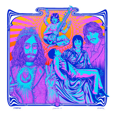
Have a look at the influence of "the psychedelic" on design for your monday inspiration!
Psychedelic design was one of the first indigenous American graphic design mannerisms. Born of LSD and marijuana drug crazes in the late 1960s, it was the language of the alternative rock-and-roll scene. It was also a code designed to appeal initially to those exponents of the youth culture, but it quickly spread like a virus into the mainstream of popular culture, where it lost much of its contraband aura.
Subscribe to:
Posts (Atom)


